Website
Mesalina Tarot
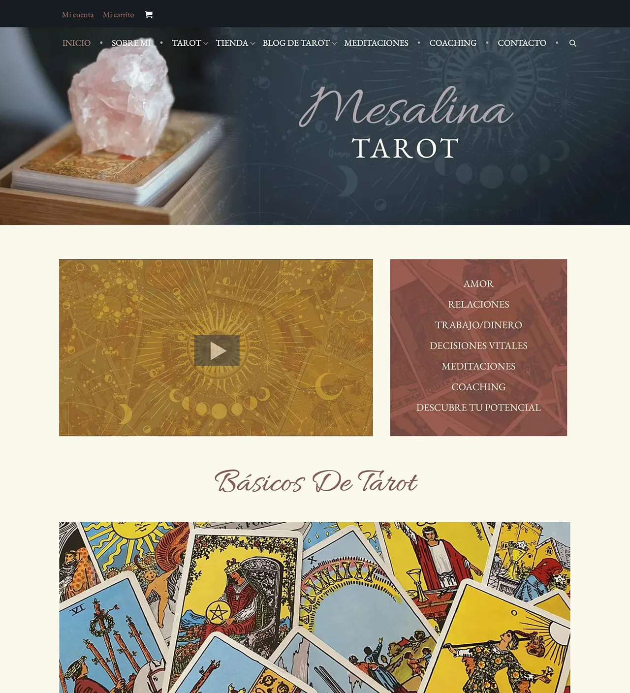
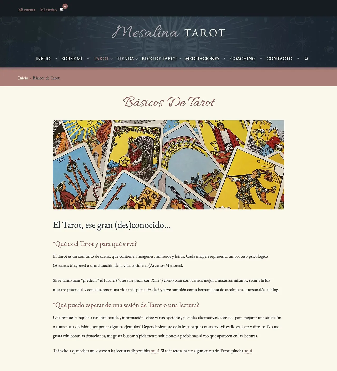
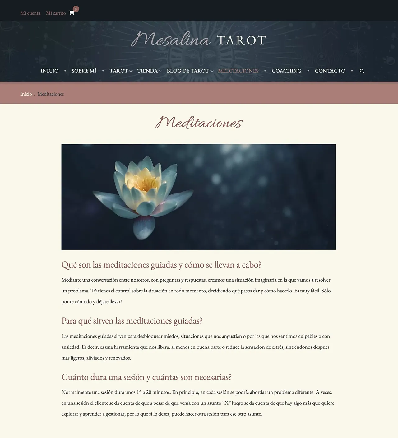
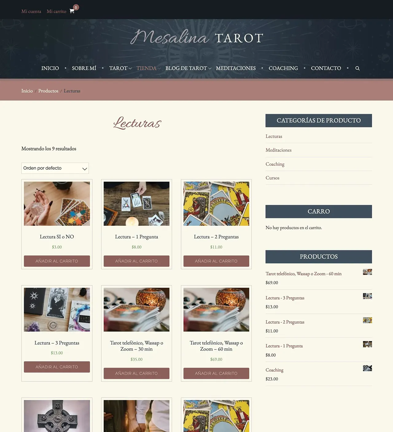
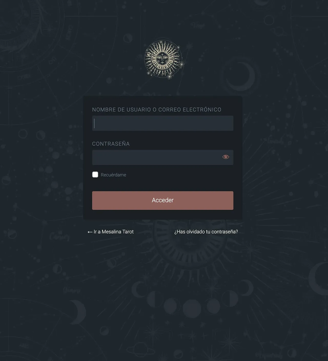
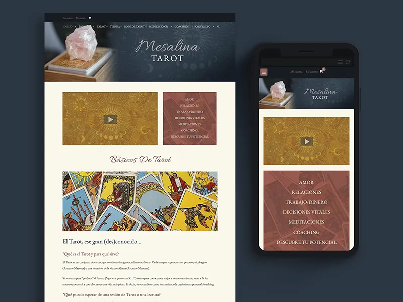
Mesalina Tarot's website isn't a deeply complex site nor does it attempt to emulate current design trends. There are no animations, no fancy parallax effects, overlays or sliders. Instead it maintains a much more simple, classic aesthetic. The design came about after long discussions with the client regarding her overall ethos and desired brand within her industry. How could we set her apart visually while keeping things simple and understated? How could we keep things grounded while simultaeneously delving into the mystical arts? Ultimately I decided to keep the color palette subdued, earthy and calming with muted but colorful accents for some pop.
Functionally, she is able to manage much of the content and maintenance herself.
Deliverables
- Website Design and Build
- Custom Theme
- Shopping Cart
- Search Engine Optimization
Tools
- Adobe Photoshop
- WordPress
- WooCommere
- QUIC.cloud CDN
- VPN Hosting
- Unsplash Images
- Self-Hosted Analytics
